Amager’s Threefold Charms
The poster series explores three different charms about Amager neighborhood. The three main sub-themes within Amager are: accessibility, diverse architectures and natures. The overarching concept of my poster series is presenting two different elements for each sub-theme. By giving division lines and contrast in each poster, it allows the viewers to clearly see two different aspects of each category.


01 Research
The research process began with an exploration of Amager, Copenhagen, including its visual overview, factual details, and statistical information. This was followed by an analysis of key characteristics, challenges faced by visitors, and the identification of a potential target audience for the town. Incorporating personal observations whenever possible adds valuable insight!
At the conclusion of the research phase, a specific target audience for the project posters was identified, serving as a foundation to guide creative directions in the subsequent phases.


02 Mindmap
Following the research phase, a mind map was created to explore the prompt, "How might more awareness about Amager be raised?" Incorporating visuals into the mind map helped expand creative perspectives and inspire ideas for the next phases.
03 Moodboard
Time for mood boards! This stage is one of the most inspiring parts of the creative process, providing visual inspiration for the project.
Mood boards help organize ideas and ensure visual consistency throughout the design.
04 Ideation Sketches
The ideation sketches emerged from a structured creative process, incorporating two key exercises: Eight Ideas and Crazy 8’s. In the Eight Ideas exercise, three minutes were dedicated to each box, generating a diverse range of poster concepts. Crazy 8’s introduced a faster-paced challenge, requiring each blank box to be filled within 30 seconds. Centered around a unified theme of nature, beach, and sun, eight distinct ideas took shape. While the time constraints can be intense, they often serve as a catalyst for innovation.

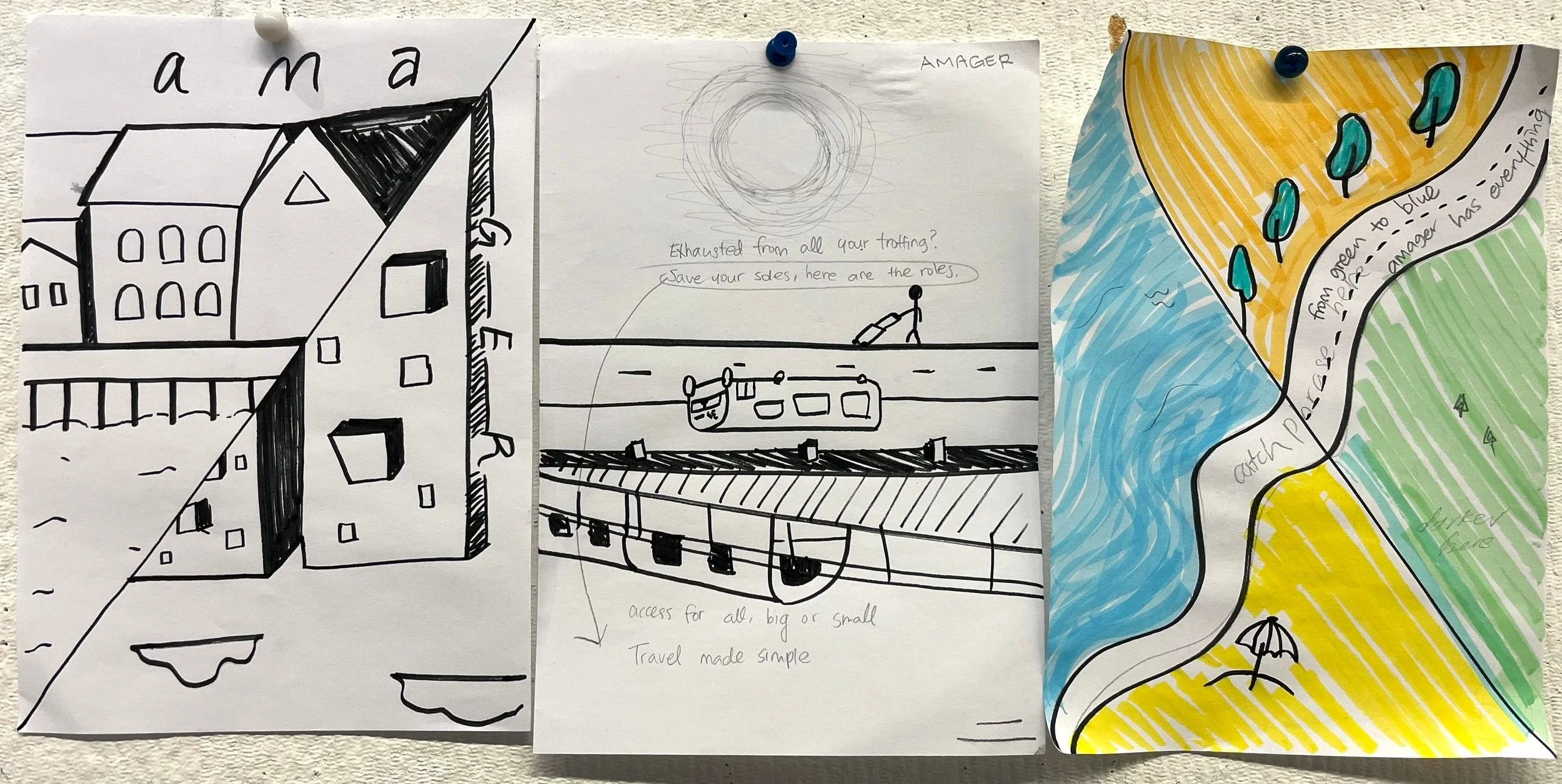
05 Detailed Idea Sketches
From the ideation sketches, selected concepts were chosen for further development. Below are two detailed idea sketches that emerged from this process.
Version 01
Version 02
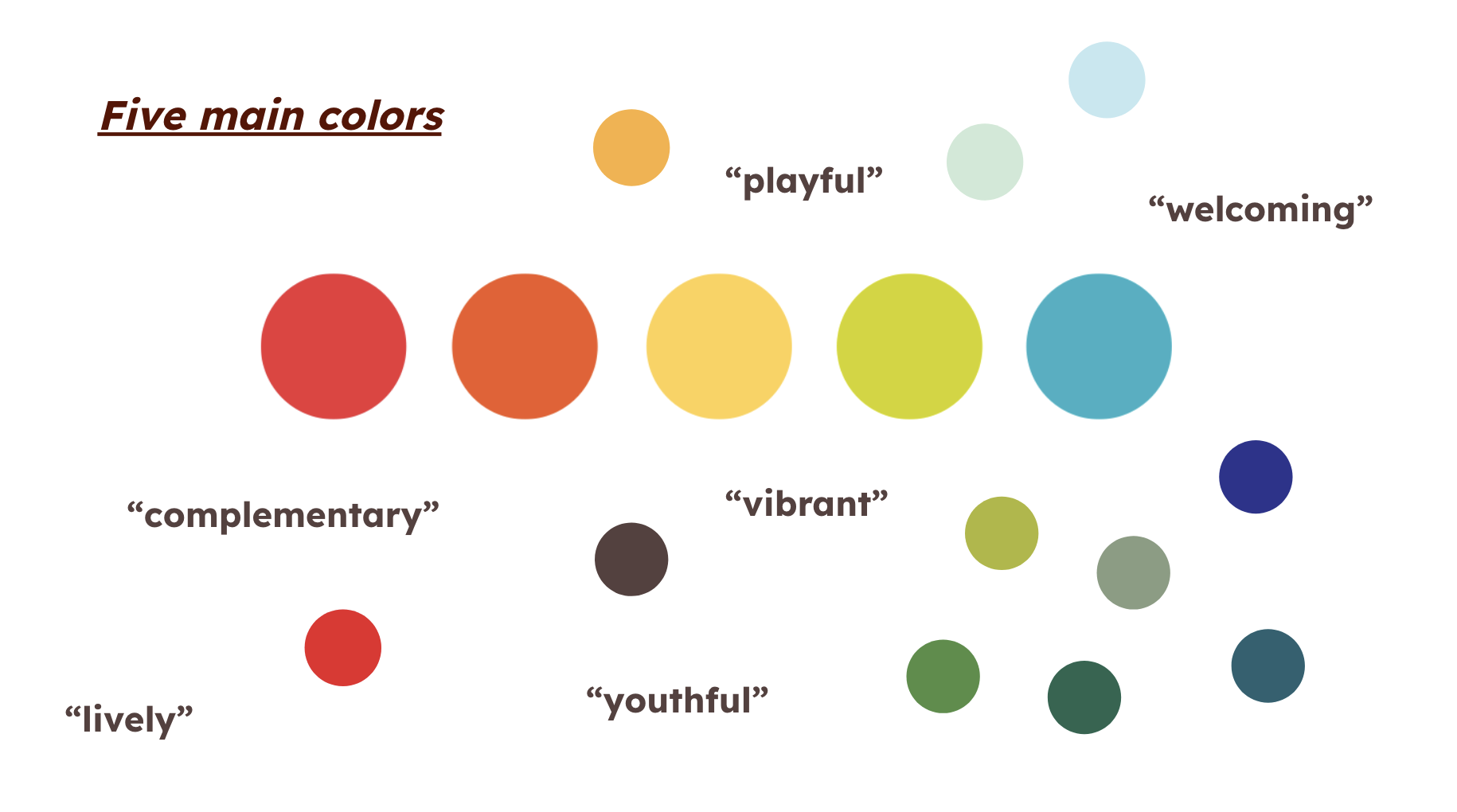
06 Color Scheme
Establishing an effective color scheme is a crucial step in the creative process. For this project, a carefully curated palette of playful, youthful, welcoming, lively, and vibrant colors was chosen to resonate with the target audience. By incorporating an energetic and bright set of hues, the goal was to evoke a cheerful, upbeat atmosphere that captivates viewers. Selecting colors that appropriately reflect the intended tone and emotional impact is essential for bringing design concepts to life in a meaningful and engaging way.
07 Layout
The layout of the posters was designed with a careful balance of creativity, meaningfulness, and visual engagement. Each design was meticulously crafted to capture attention while effectively conveying a clear message.


08 Typography
