LoYo
LoYo
A fictional Danish Supermarket
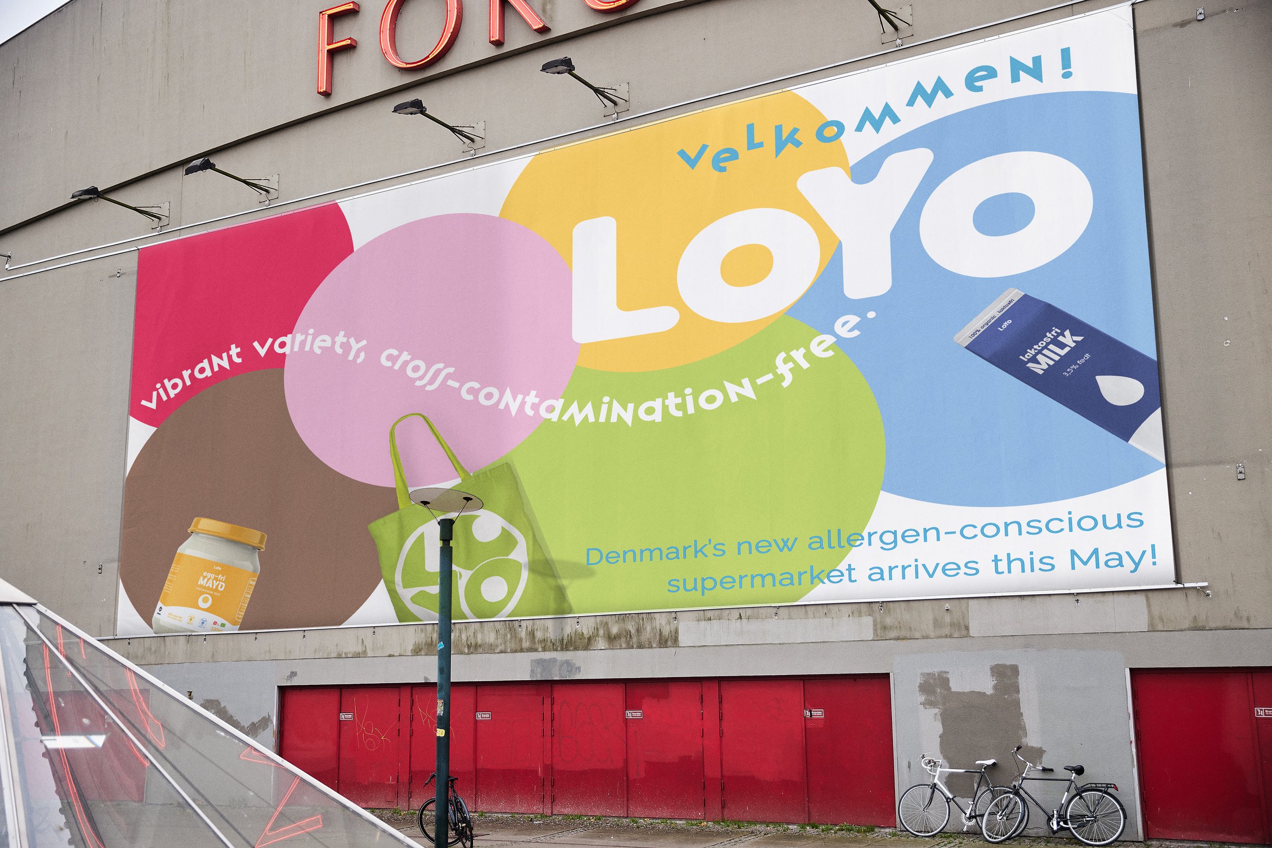
velkommen!
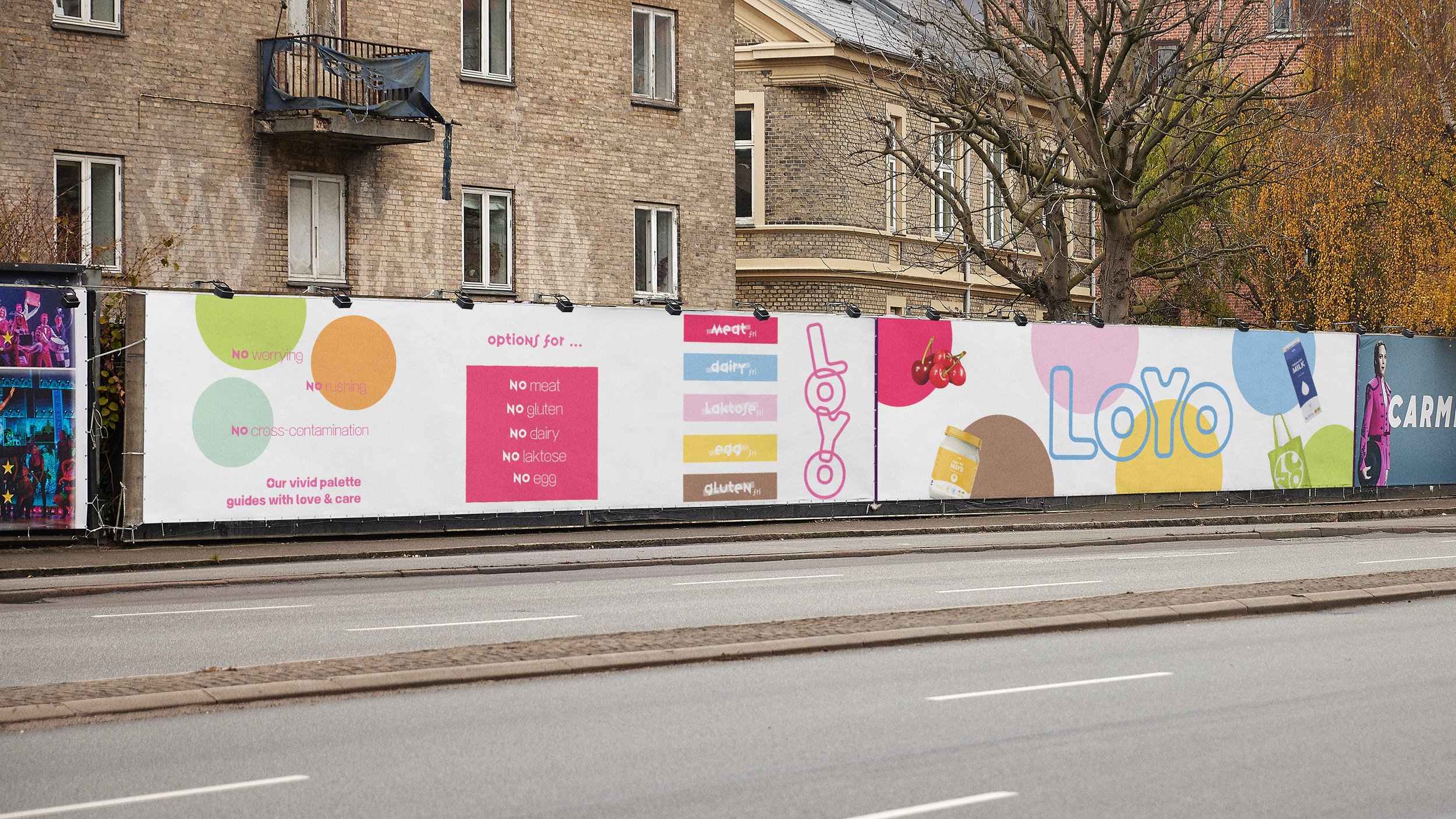
LoYo is a fictional Danish supermarket brand.
LOYO = LOve + beYOnd
It is the only supermarket in Denmark that deeply cares about different allergens for people who are extremely intolerant, offering easy access to strict allergen-free products amidst the mass production and cross-contamination risks of this era.
#caring #loving #intentional #convenient #friendly
The LOYO brand identity revolves around the core concept of circles in six distinct colors, each representing a different allergen to effectively communicate with potential consumers who may have dietary restrictions or allergen concerns.
LOYO reinforces this cohesive brand identity by consistently incorporating circular elements across all design applications - including posters, product packaging, tote bags, price tags, and other customer touchpoints.
This systematic use of the circular element ensures a unified and recognizable visual language that solidifies the brand's image and association with allergen awareness.
Target Audience
Primary : consumers with dietary restrictions, who seek for gluten-free, lactose-free and other allergen-free products
Secondary : consumers who value organic/premium quality ingredients/foods
loyo’s mascot & the embedded meaning


←
←
L + O + Y + O
follow LoYo’s six colors
follow LoYo’s six colors
“each color has its own meaning!”
meat-free

egg-free

dairy-free

non-gmo

lactose-free

gluten-free


Introducing LoYo’s Packaging Lines
Introducing LoYo’s Packaging Lines


LoYo’s Tote Bag


wayfindings


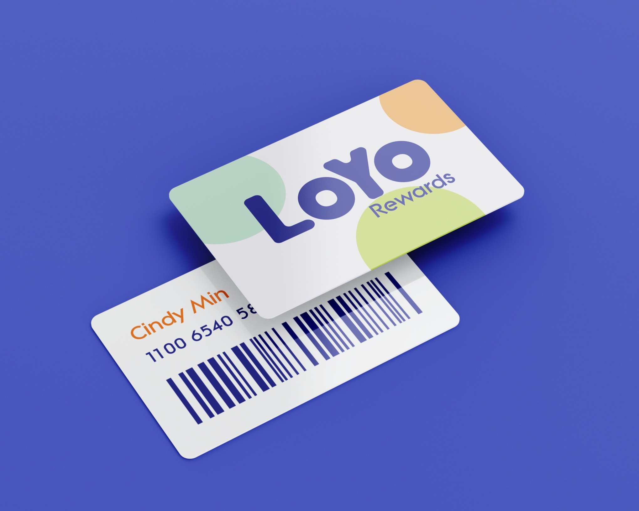
Loyalty card
digital experiences


See You @ LoYo
〰️
See You @ LoYo 〰️